Maximizing Purpose-Driven Design
USA Today’s “Race in America” special edition. Cover design by Jerald Council
By Jerald Council, CouncilMag.com
Purpose-driven design is a creative strategy that’s motivated by intent and result.
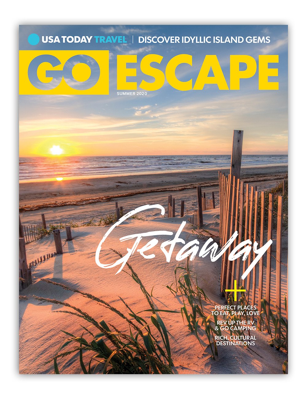
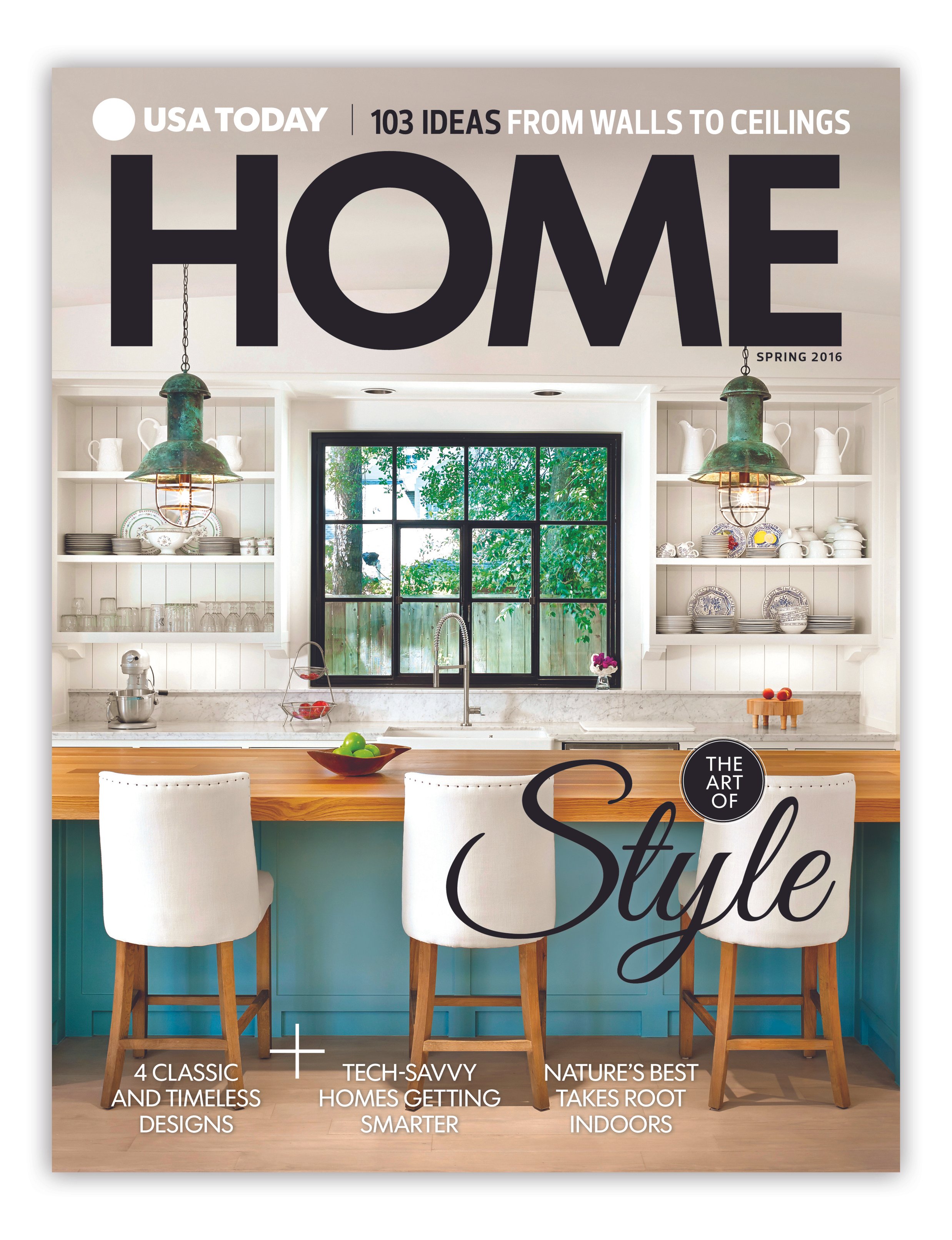
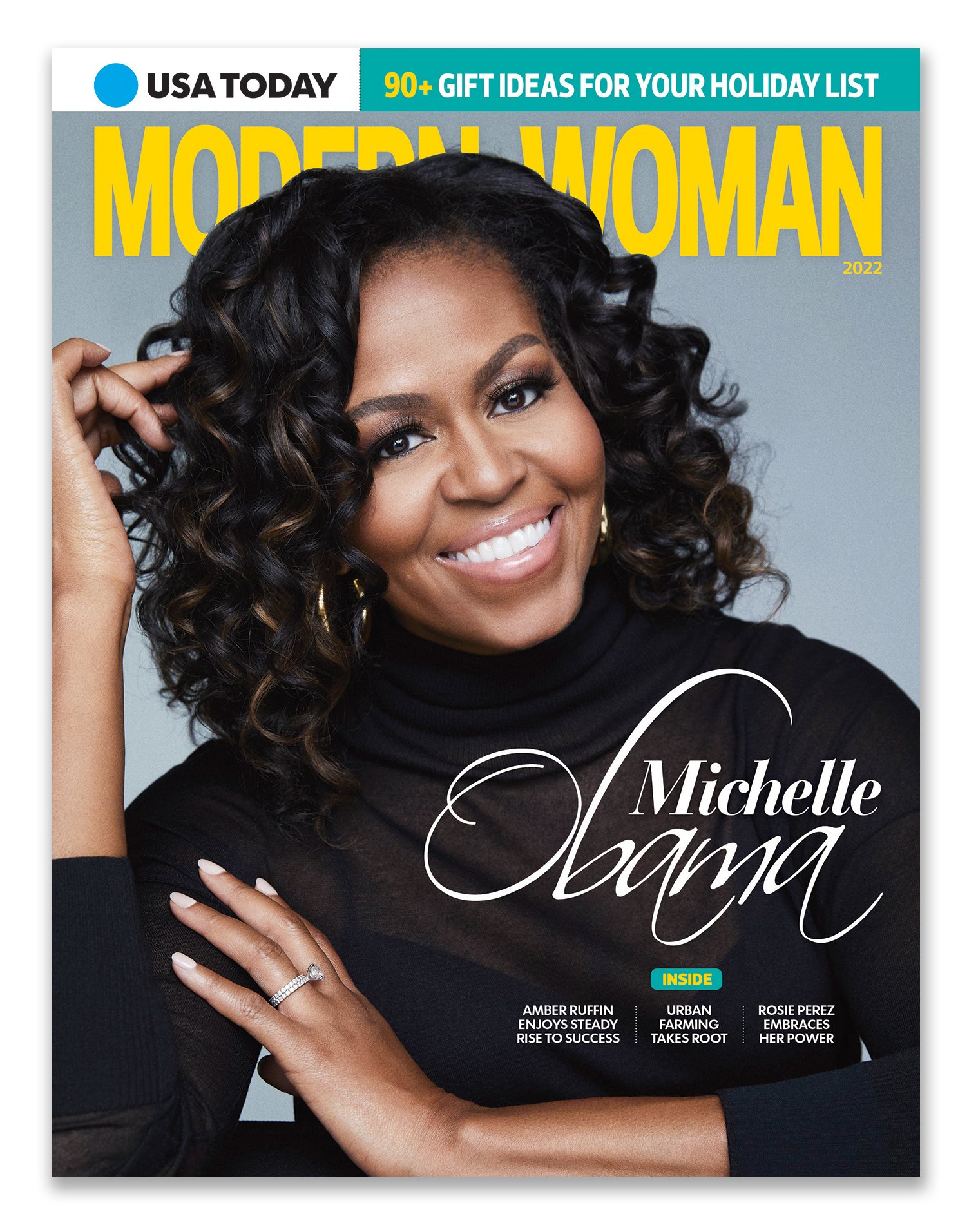
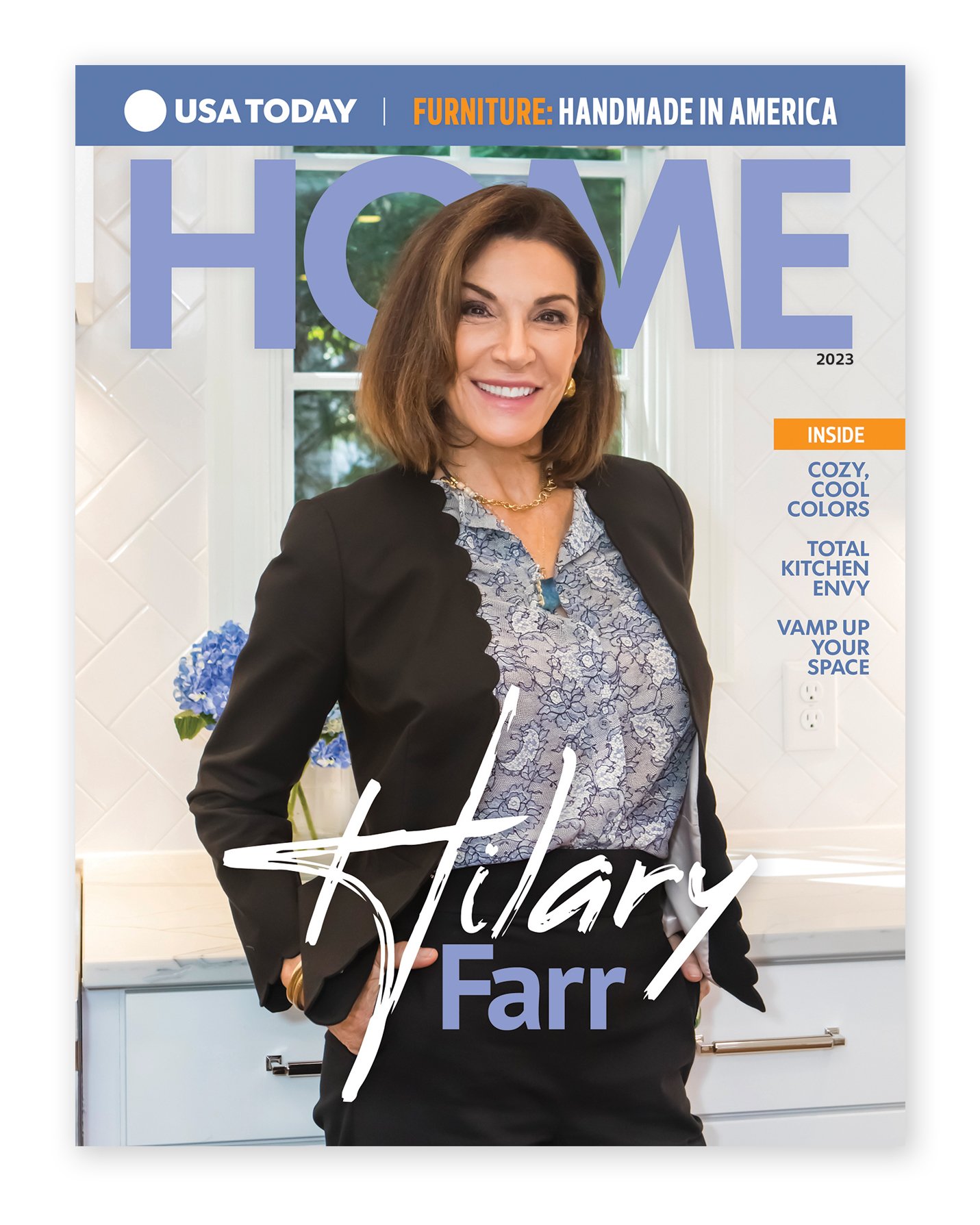
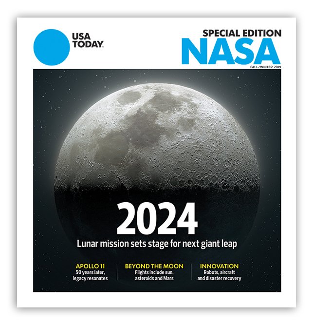
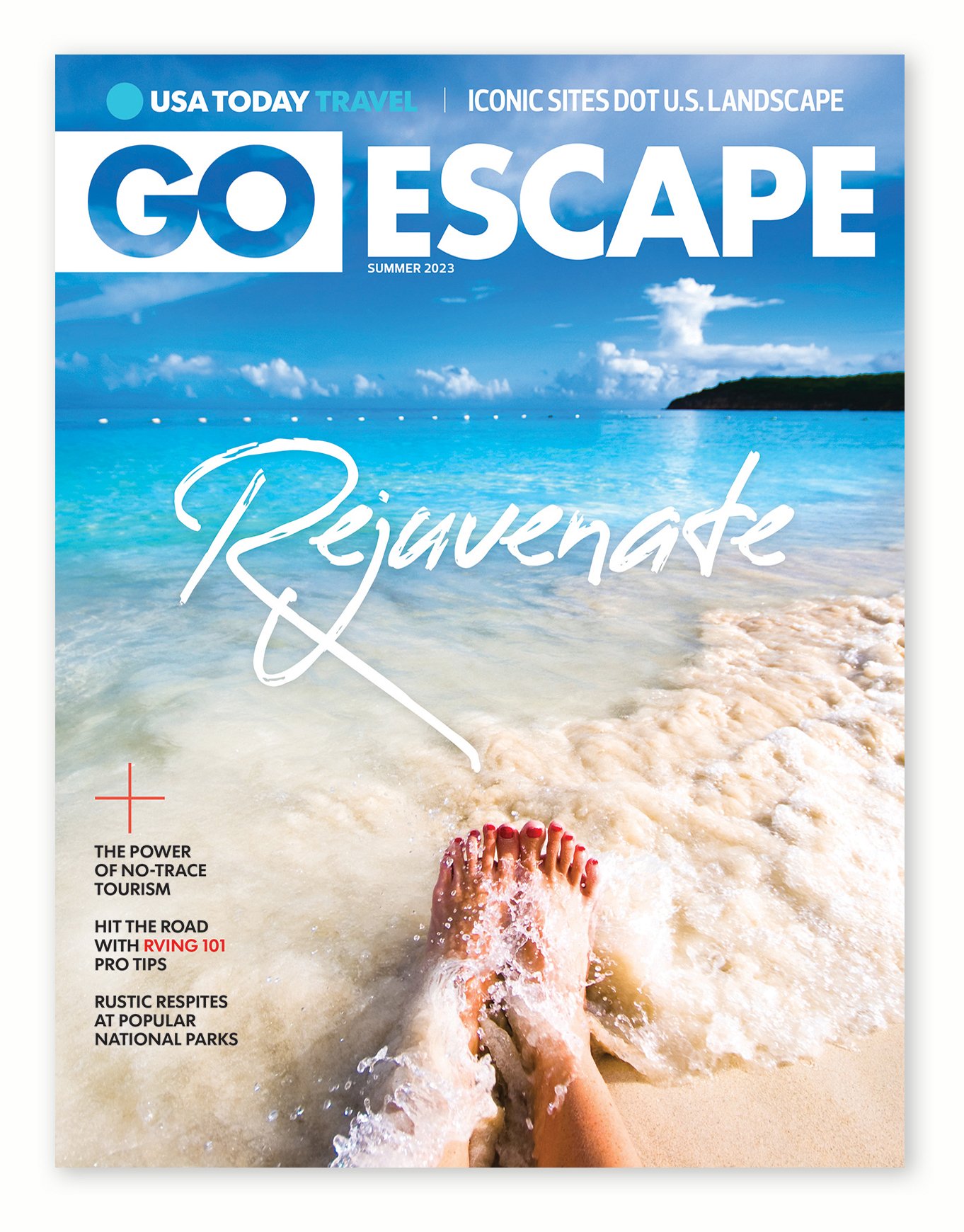
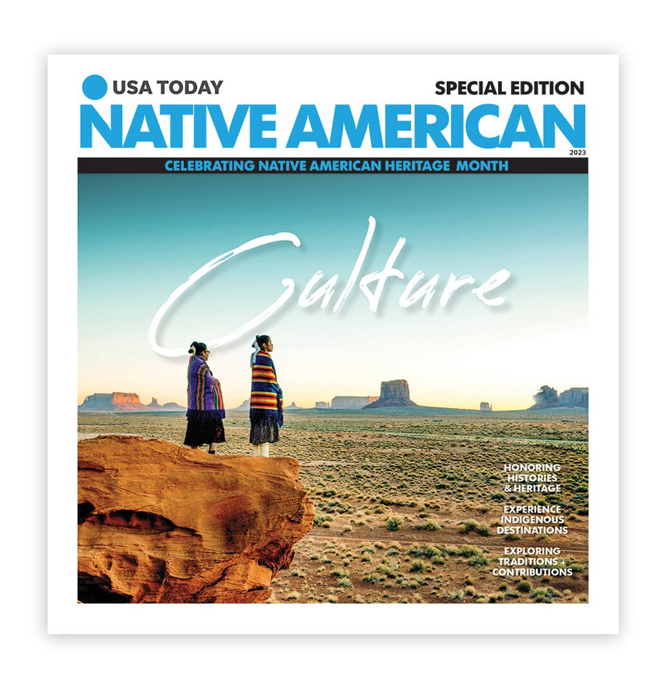
As creative director for USA Today’s premium magazine group, Studio Gannett, I have spent a decade designing nearly 200 magazine covers with one single goal in mind: to design covers that hold readers’ attention long enough to influence their purchase decision. Whether the product is online or on newsstands, the goal is the same.
Of course, the journalism must be intriguing and useful. Conversely, if the cover image isn’t captivating, I lose the opportunity to influence potential buyers’ decisions.
““A creative mind has no limitation.””
I can’t always predict the outcome, but purpose-driven design can help spark a good conversation among buyers standing in the checkout line deciding whether to purchase a magazine. My intent is to generate interest and get people talking about what’s on the cover. I have become a bit of a pro at maximizing creativity to reach various audiences by utilizing design.
Cong Abbey is a historic site featuring early gothic architecture and masonry in Ireland. Video captured and edited by Jerald Council
I recently had the opportunity to visit Ireland. I stayed at the 800-year-old Ashford Castle in the village of Cong, in County Mayo. While there, I took in the art, culture and unique early gothic architecture and masonry. I believe creative thinkers recall big ideas from their experiences. For example, my memories of Ireland reignited my love for global communities. Ideas that are motivated and conceived with empathy will resonate with consumers. These ideas originate from a lifetime of exposure and familiarity. Employing the full scope of your experiences allows you to better relate to various communities and understand their wants.
Afternoon tea is held in The Connaught Room at Ashford Castle. Video captured and edited by Jerald Council
Effective visual design takes into consideration several elements of design. According to Skillshare blog, there are eight essential elements of graphic design: line, shape, form, texture, space, imagery, typography and color. These elements are used to elevate communication and open a whole world of successful creative possibilities. My intent is to influence consumers’ purchasing habits by using these visual aids. Factors such as perception, family, beliefs, status, age, income and more can impact buying behavior. Purpose-driven design is impactful, useful and can stimulate personal engagement. As the old adage says, “Use a picture. It’s worth a thousand words.”
Purpose-driven design requires creativity
Before the ideation process begins, it’s crucial to fully understand the purpose of the project. A purpose statement defines the commitment, scope, and direction of the project. Once I receive the statement, the sky is the limit for design. I can then offer various design solutions that speak to unique communities in one cohesive voice. Whether the topic is travel, food, race, education, real estate or lifestyle, I use beautiful color palettes in my presentations. Offering readers compelling or beautiful travel locations makes all the difference when designing a successful magazine cover. Purpose-driven design can dramatically improve your message and result in reaching a maximum number of consumers.
Finding the right mix
Great design relies on great journalism. They complement each other and simplify the communication. When words and visuals work in harmony, consumers are able to receive the whole message immediately. Aristotle, an ancient Greek philosopher, coined the phrase “the whole is greater than the sum of its parts.” When headlines and images work together to present one succinct message, it’s quickly received. Otherwise, the cover appears patched together with elements that are incoherent.
The unification of words and art makes an influential cover
USA Today’s “Back to School” cover design by Jerald Council
A good example of this would be a cover I designed for USA Today’s “Back to School” magazine. The headline read, “Tech leads the way.” Complementing the headline was a photo of an elementary-school girl reaching for the stars. Signifying a future trip to the moon, she was outlined in a chalk spacesuit. The headline and art elements worked together in harmony to serve a single purpose. Powerful communication is effective when it speaks to its intended audience. So remember, purpose-driven design is a creative strategy that’s motivated by intent and result.
Jerald Council’s professional career includes award-winning creative work at some of the nation’s top media companies. He has led informational graphics teams that produced maps and/or graphics that accompanied multiple Pulitzer Prize-winning stories including: Lisa Pollak of The Baltimore Sun in 1997; Gary Cohn and Will Englund of The Baltimore Sun in 1998; Alan Miller and Kevin Sack of the Los Angeles Times in 2003; and Sonia Nazario of the Los Angeles Times in 2003.


